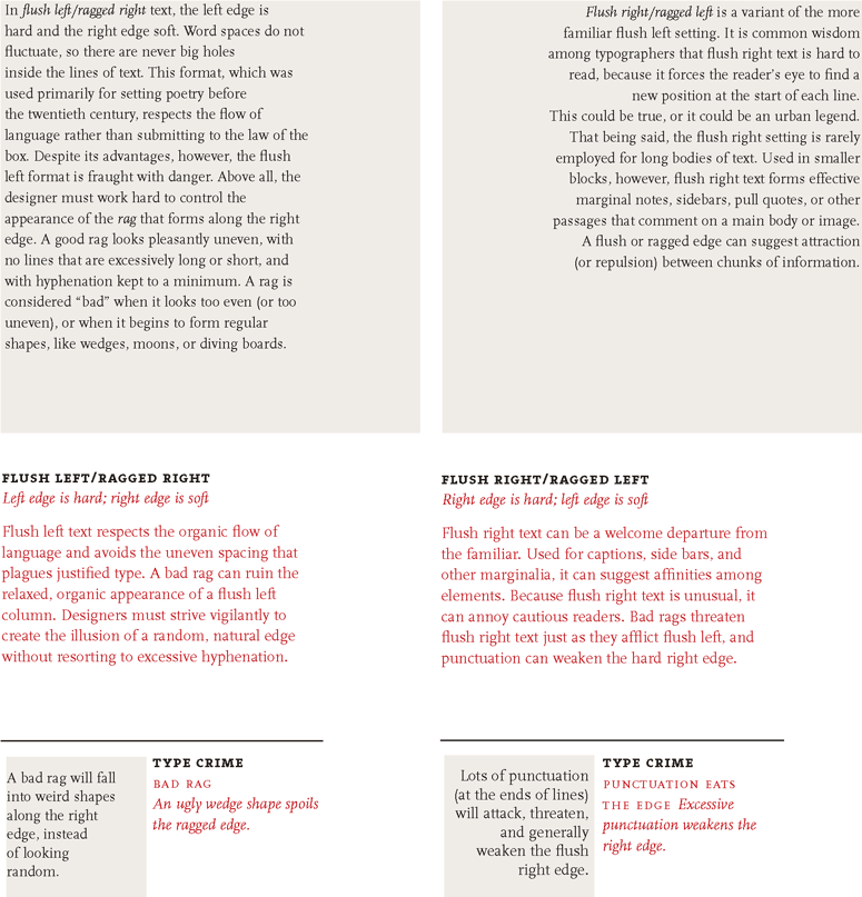
“Well-set type doesn’t draw attention to itself, so it’s often hard to see what’s gone right in a nicely composed page. What’s gone wrong is a different story”
Badly set type can fail aesthetically or practically. The goal is to know the rules of the craft, so that the type you set serves the text and the reader in ways the both deserve.
Alignment


We started the project by researching our words that we worked on before. My word is “اقدام”. It translates to “moving forward with something or the act of doing something”

This is how I tried to typeset my paragraphs on an A5. I tried to use the space by creating rectangular shapes and crossing them over each other. It’s a bit too tight in the middle between the arabic and the latin. It needs some space to breathe.
What are widows and orphans?
- The typeface chosen should be read without effort.
- Sans serif types are often paired with seriffed type.
References
