


The task is to arrange the words to form a 10 – 15 word grammatically correct sentence. The meaning can be playful, absurd or ridiculous. This is what I came up with.
[ Arabic ]
ذهبت الى الدوحة. شرب الجمل كركي فعضضته
[ Latin ]
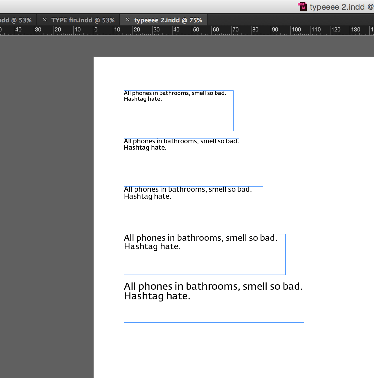
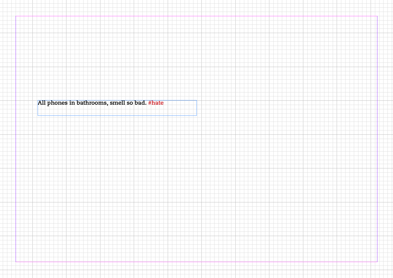
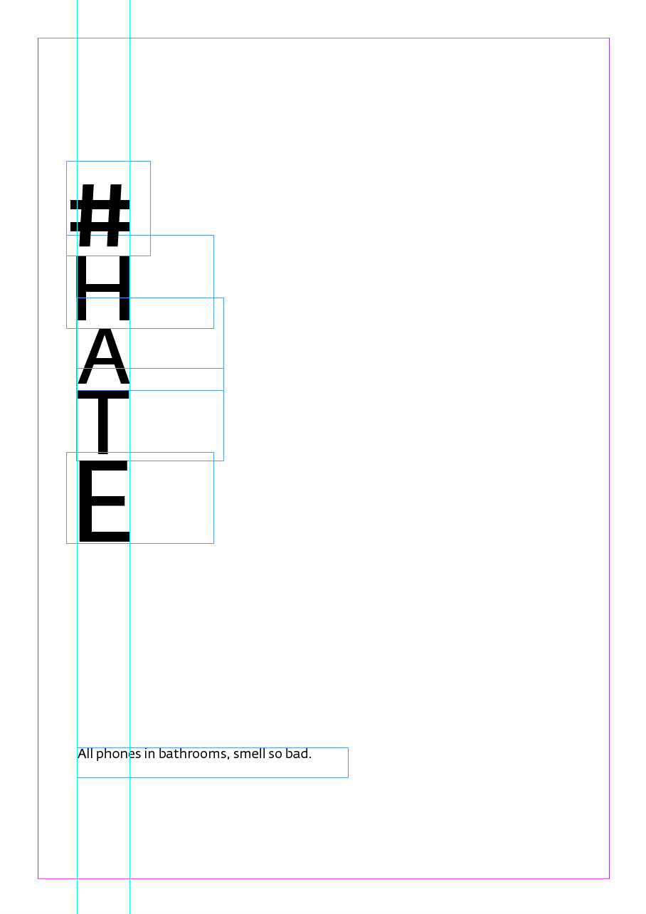
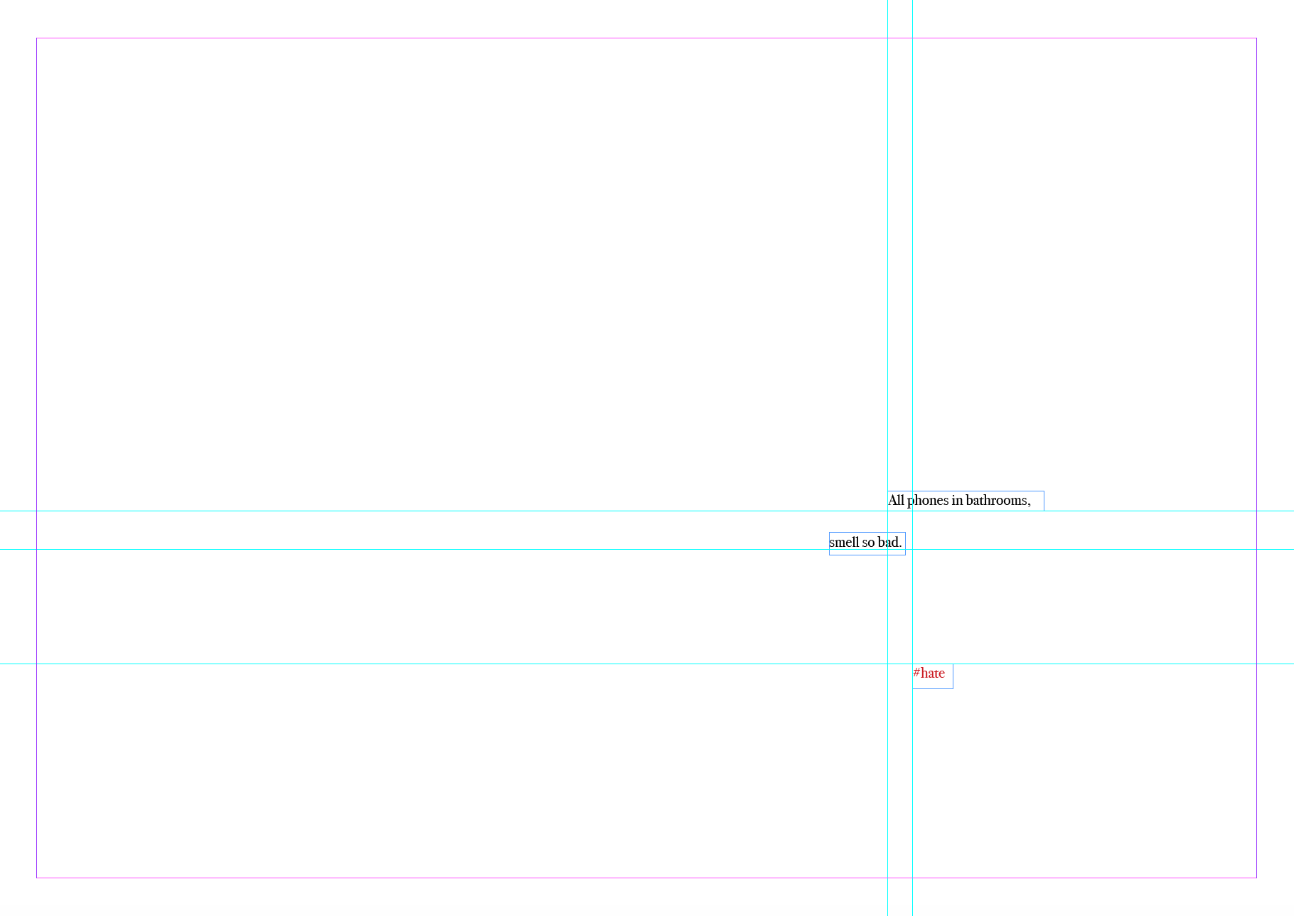
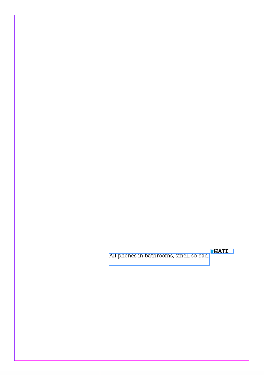
All phones in bathrooms smell so bad. Hashtag hate.
Typeface choice (Click on the typefaces to see examples)
[ InDesign ]
Opening InDesign for the very first time, I was really taken by surprise. The application can be quite intimidating at first. Where do you start? What do you learn first?
I started to navigate through the application, and learned more in our introduction to InDesign in class. about a variety of topics to help make you successful including color, effects, rulers and guides, layers and object organization as well as some of the really powerful styles that InDesign uses. By the end of this training, you will have accumulated a solid foundation of knowledge and be ready to move deeper into the powerful application.

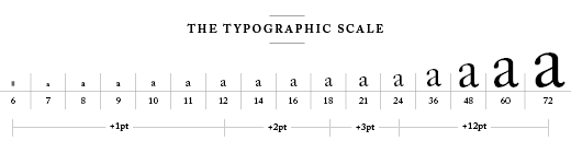
Avoid using these functions, because they stretch the type.

Never use this function, it also stretches the type.

Helpful options.


[ Spacing ]
Typographer’s don’t only focus on the positive nature of letterforms, but the negative gaps between and around them as well. Spacing is crucial, because it translates the sound of speech into understandable words. French philosopher Jacques Derrida, said that type cannot function without silent marks and spaces. You need to figure out how to break up the space, in other words, think about the natural breaks in a sentence. You have the power to influence the way something is read, that’s why its important to understand the way words break.
Readingthisisgoingtobehardifyoureaditwithoutspacing.
[ White Space (Negative space) ]
The space where no text or image exists. It is as important as the placement and sizing of the text itself. It enables hierarchy by allowing the reader to rest while navigating the design by isolating an element that demands attention. It can add tension of even a dramatic effect.
[ Measure ]
The way to figure out a good measure of type -how many characters there are on a line-, what you’re looking for is a number between 55 and 75. It all depends on the width of your text box. Also, avoid lots of hyphenations and lots of broken lines. Count the characters to figure out what makes a measure, and pay attention to how many characters there are per line.


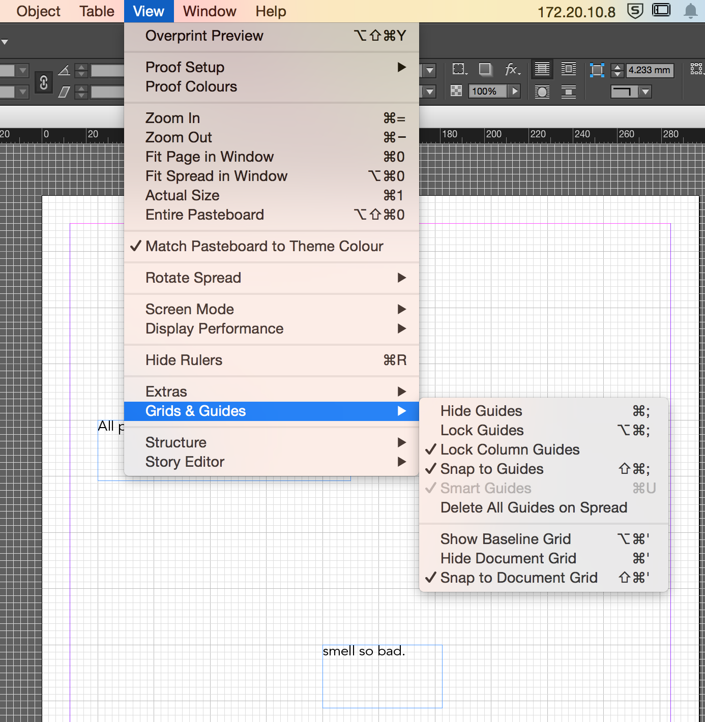
Showing the document grid is definitely a helpful option, to place the type coordinately on the document.


Ways to think about type: What’s working? Whats not working? How can you improve it?
Your job as a designer is to figure out how type looks best on the page. Therefor, when you make a design decision you need to be able to defend it. You need to think about what you do with type and why you did what you did.
[ iterations ]


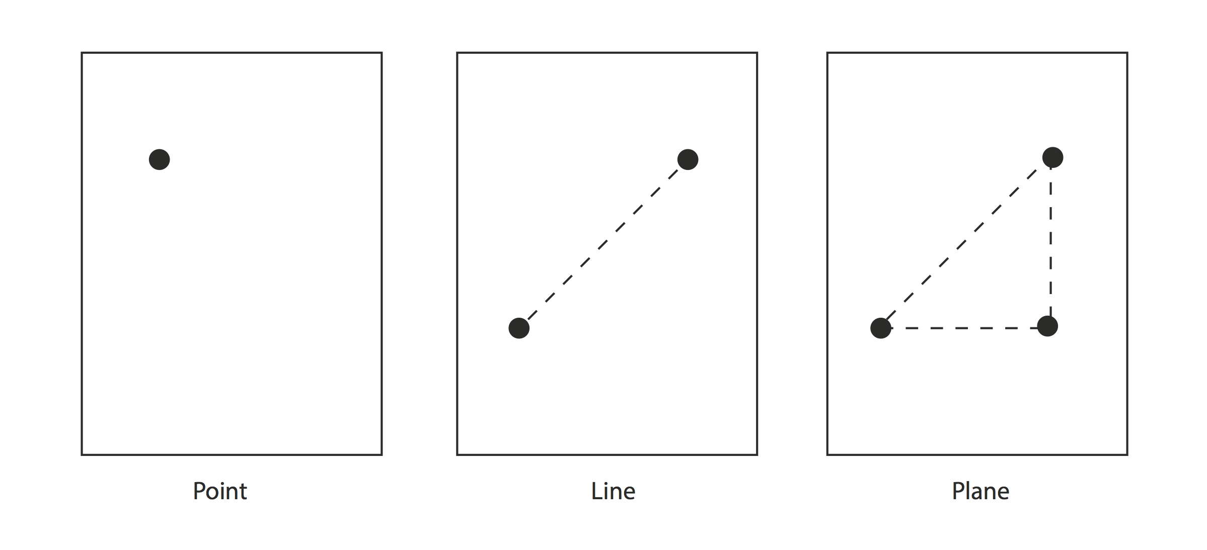
Point diagram
Interesting learnings
- Italic was designed to look like Italian hand writing.
- Slab serifs feel like bricks. They’re called Egyptian and grotesque ex: (Bodoni).
- Some words like “the” are empty words, that don’t have a meaning but help us connect our words.
- Never use a typeface that is named after a place.
- Justified text looks much neater, but you have to learn how to deal with spacing issues.
Reflection
As a designer you start to emphasize on certain things. I learnt how to experiment and think about sentences in a way that creates a contrast, that takes you to an interesting kind of pattern. It’s important to stick to one scale, and figure out how to let it live on the page in an interesting way.
You have to make the decision that influences the message of the text. An image can be read in various ways, so can type. When you work with two languages such as Latin and Arabic, you start to notice certain things. Some things you can do in Arabic, but can’t do in Latin, and vice versa. In latin we have many more styles we can play with.
In simple words, to summarize this project I would say that the main thing I learnt, is to make things legible and beautiful typographically.
References & links
Palacio, Bryony, and Armin Vit. Graphic Design, Referenced: A Visual Guide to the Language, Applications, and History of Graphic Design. Beverly, Mass.: Rockport, 2009. Print.
Lupton, Ellen. Thinking with Type: A Critical Guide for Designers, Writers, Editors, & Students. New York: Princeton Architectural, 2004. Print.
